An approach towards happy physicians.
Design as a concept has matured from a largely artistic endeavour to an arena where problem solving is taking the centre stage. Today’s designers are seen as the core essential elements who solve problems, beginning with technological and social problems to increasingly complex prospects.
When we look closely into the life of doctors it becomes very evident that their lifestyle is beyond comprehensions with various roles they play. To design a solution which is meaningful to them and the organisations they work for is task threaded with observation, research, patience, creativity and lots of coffee.
Design by default means convenience. And convenience is built by demolishing the clutter. So the principle approach we take here is to observe and understand things by breaking them down – If you know what to look for, it becomes easier to design when you see it.
Before I make it any more nonfigurative, let me guide you through a process I followed while we were designing an Electronic Health Record solution for physicians which has been recognised for its usability by ‘The Usability People‘.
Some people think design means how it looks but of course, if you dig deeper it’s really how it works. -Steve Jobs
Make use of secondary data
There are many trusted sources from which you can get readily available information. I’ve chosen HIMSS EHR Usability Pain Point Survey as a starting point. The report clearly states the frustrations and associated functionalities which require a significant level of attention to encourage physician adoption.
If you are planning to switch EHR systems, which factors are influencing your decision?
67% of the respondents are dissatisfied with system functionality.
Multiple responses allowed
Source: 2014 EHR Survey; MPI Group/ Medical Economics
Results from HIMSS Usability Pain Point Survey
Reviewing Clinical Data
Too many clicks to accomplish simple tasks, cluttered screen layouts, and difficult navigation were the key issues reported while reviewing clinical data.
Clinical Decision Support
Lack of customization of CDS alerts and the inability to configure the notifications leading to alert fatigue were sighted as issues.
Organize interviews, but not quite literally
Plan research, prepare for sessions and analyse findings. The idea is to bring physicians to participate in your design process. Now, it is important to maintain a balance between nailing the doctors with pointed questions Vs asking them about their neighbour’s dog. If you can clearly comprehend what I mean, after a couple of interviews with a good sample size, you will arrive at a persona like this (or maybe a better one).
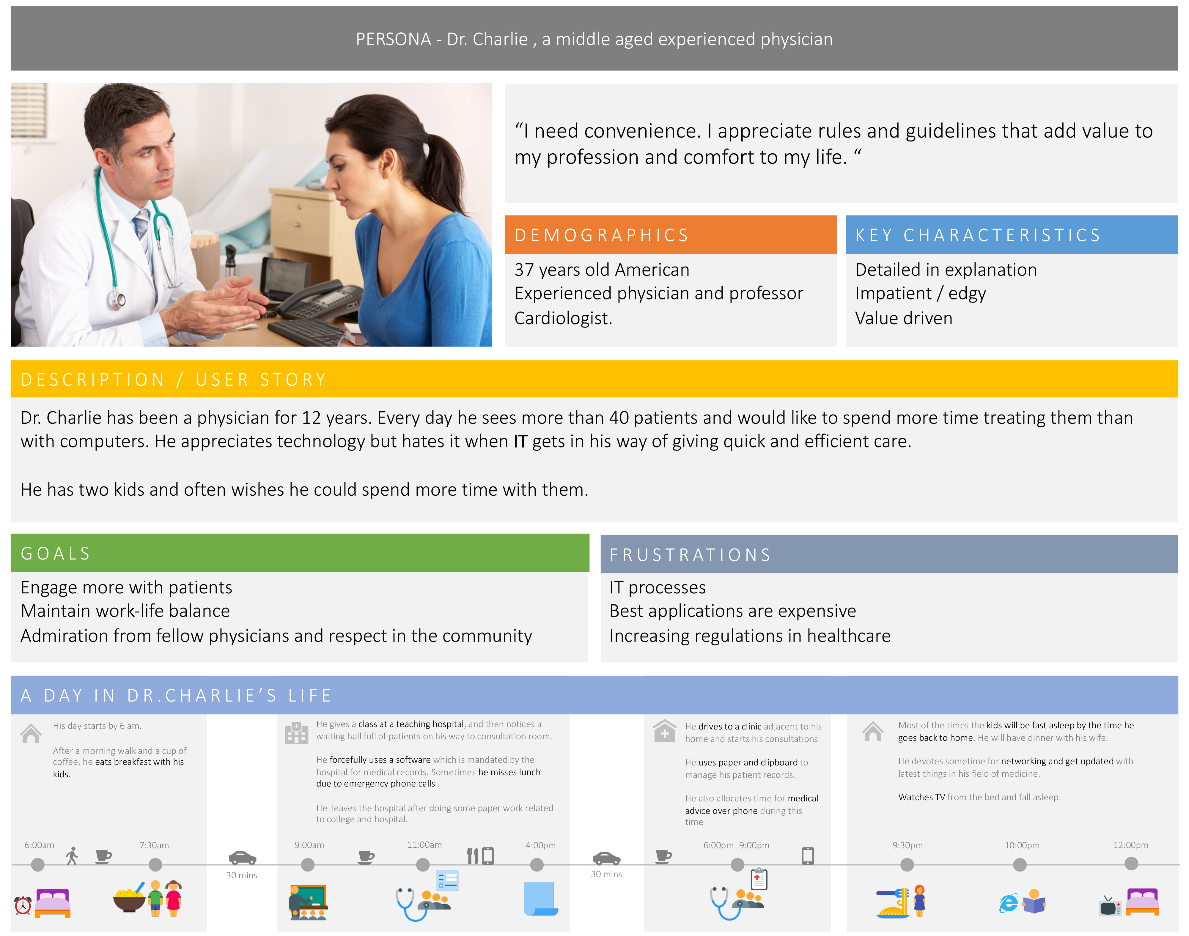
A good persona is like a light from heaven
It guides you through dramatic user stories, chilling workflows and eliminates any usability obstacles on key user journeys.
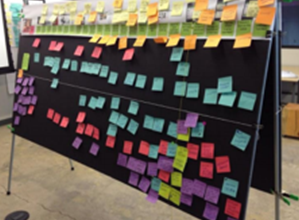
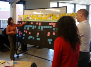
At this point of time, a designer should work closely with the functional team in a room stuffed with charts, whiteboards, post-its, sketch pens, scotch tapes, photographs, binder clips and nylon strings. The closer the room gets to appear like a crime scene investigation the better you are at your job.
By the end of this brainstorming session, you will have a complete picture of what a physician wants and why he wants it, whom he contacts and how he interacts, when he needs the information and where he expects it to be.

Kick the creative grenades out of your brains
Let them explode within the logical borders defined so far. Structure your ideas, identify the patterns and create wireframes against user flows. you can start with paper prototypes and slowly arrive at a more functional one using Photoshop, Illustrator or any tool you master. Follow the brand guidelines of your company and define colour pallet, icons and typefaces.
Make time to spend with the technology team at this point to design style guides, navigation, gestures, responsiveness, transitions and other micro-interactions that are crucial in communicating with the doctor. It’s not about how beautiful it looks; the main goal is ensuring that a doctor could deliberately differentiate between supportive texts, error messages, task notifications and emergency statements.
It’s just the beginning
Validate your goals against what you have achieved. Perform AB tests with a close group of doctors and plan a short roadmap of improvements. Remember that a design that follows a methodological process will eventually end up being scalable and could accommodate more feature requests over time not because it was born out of a great Photoshop mockup but because of the consideration to physician’s needs.
In the end, the question is whether your design is usable, aesthetic, and human like a doctor’s touch.
It will be. Because you did not design alone!

![[ Press Release ] Hinai X : Empowering digital health communities](https://icthealth.com/wp-content/uploads/2016/01/digital-health-community-500x383.jpg)

